What Is a Waterfall Chart?
A waterfall chart is also known by many other names: waterfall graph, bridge graph, bridge chart, cascade chart, flying bricks chart, Mario chart (due to its resemblance to the video game), and net profit waterfall chart. Regardless of the name, this versatile chart is a great way to provide a quick visual into positive and negative changes to a value over a period of time.
Within a waterfall chart, the initial and final values are shown as columns with the individual negative and positive adjustments depicted as floating steps. Some waterfall charts connect the lines between the columns to make the chart look like a bridge, while others leave the columns floating.
Waterfall charts became popular in the late 20th century, when the management consulting organization McKinsey & Company used them in presentations to clients. Then McKinsey associate Ethan M. Rasiel made them widely popular in corporate analysis in his 1999 book, The McKinsey Way.
The key feature of a waterfall chart, per Rasiel, is that it shows changes not only over time, but in relation to the previous period or other milestone of measurement. Each step in the waterfall gets you to the final result and demonstrates how you got there. And the beauty of a waterfall chart is its simplicity of construction, even in analyzing complex information — which means it will likely enjoy heavy use into the future.
Project Management Guide
Your one-stop shop for everything project management

Ready to get more out of your project management efforts? Visit our comprehensive project management guide for tips, best practices, and free resources to manage your work more effectively.
When to Use a Waterfall Chart?
Waterfall charts are helpful for a variety of scenarios, from visualizing financial statements to navigating large amounts of census data. Here are some examples of situations where you might want to use a waterfall chart:
- Evaluating company profit.
- Comparing product earnings.
- Highlighting budget changes on a project.
- Analyzing inventory or sales over a period of time.
- Showing product value over a period of time.
- Visualizing profit and loss statements.
- Creating executive dashboards.
- Tracking consulting jobs.
- Keeping track of retail inventory.
- Documenting contracts.
- Demonstrating how operating costs have changed from one time period to another.
- Contrasting competitors.
Who Typically Uses a Waterfall Chart?
Waterfall charts began as a way to track monetary performance over time and have become a mainstay among financial industries and departments. However, more and more industries, as well as departments within those industries, are finding it useful to adopt waterfall charts to track and present performance. These include the following:
- Sales companies and teams
- Developers and IT professionals
- Retailers and ecommerce companies
- Legal departments and lawyers
- Construction companies
- Educators and exam-scoring companies
The Benefits of Using a Waterfall Chart
Waterfall charts are a simple visual format that presents your data in an impactful manner, which is why they have become increasingly popular in recent years. There are other benefits of using waterfall charts as well. Here are some examples of advantages you can enjoy:
- Customize the appearance of your waterfall charts, as you would with any other chart.
- Make them as simple and bare-bones or as complex as you like.
- Deploy them for analytical purposes, especially to explain or present the gradual changes in the value of an item.
- Study a wide variety of data, such as inventory analysis or performance analysis.
- Demonstrate how you have arrived at a net value, by breaking down the cumulative effect of positive and negative contributions.
The Challenges in Using a Waterfall Chart
That said, there have been and continue to be challenges in creating and using waterfall charts. Some of the roadblocks users have encountered include the following:
- Before Office 2016, creating waterfall charts in Excel was very difficult and labor-intensive. The instructions below are for editions before Office 2016; the PowerPoint instructions are for 2016 and later editions.
- It can take a lot of input work to set totals.
- There’s a lot of unnecessary data and content around and on the chart.
- It takes too many clicks to break the axis.
- It’s not possible to display relative contributions in percentages.
- There’s no difference in the highlights.
- You can’t create a vertical Excel waterfall chart.
- They don’t allow subtotals.
- Scaling multiple charts is time-consuming.
The Typical Features of a Waterfall Chart
Each waterfall chart will have a slightly different appearance, depending on the type of data you choose to visualize. However, your final chart will likely include the following features:
- Floating Columns: To quickly provide a visual into the status of a value over time, the floating columns (also known as plot or plotted values) represent the positive and negative changes made to the initial value.
- Spacers: Because each of the columns in a waterfall chart don’t begin at zero, they need to be offset by a certain margin. This area is known as the spacer or padding.
- Connector Lines: The connector lines (also known as datum) show the relationships between the floating columns. Although they are not necessary for all waterfall charts, connector lines can be a helpful addition to improve the professional look of your chart.
- Color Coding: By assigning specific colors to the different column types, you can quickly tell positive from negative values and provide a quick visual of the movement over time.
- Crossover: There are some instances, depending on the values you're plotting in your chart, where the values will move across the x-axis. For example, if you are creating a waterfall chart as a visual for a profit-and-loss statement and the first figure is 1,000 while the second figure is -2,000, part of the floating column will be above the x-axis and part will be below. This is an important feature of the waterfall chart, as the chart should adjust automatically to show movement across the axis.
Download Our Free Excel Waterfall Chart Template
The easiest way to assemble a waterfall chart in Excel is to use a premade template. A Microsoft Excel template is especially convenient if you don’t have a lot of experience making waterfall charts. All you need to do is to enter your data into the table, and the Excel waterfall chart will automatically reflect the changes.
Download Waterfall Template
Excel (2016/Office 365) | Excel (2010-2013) | Smartsheet
When adding your own data to the template, the waterfall chart will automatically update, but you may need to add or delete rows in your table depending on how much information you need to input. Adding or deleting rows could throw off your column formulas and totals. The solution is to copy the column formulas down to adjacent cells using the fill handle.
If you’re unsure how to fix the formulas as you add new rows, see below for “Step 2: Insert Formulas to Complete Your Table.”
After updating your waterfall chart to fit your needs, you can simply copy and paste it as an image into a PowerPoint presentation, dashboard, or report. Also, see the separate “How to Create a Waterfall Chart in PowerPoint” section below.
How to Create a Waterfall Chart in Excel
If you want to build a waterfall chart of your own, we’ve got the step-by-step instructions for you. Although Excel 2016 includes a waterfall chart type within the chart options, if you’re working with any version older than that, you will need to construct the waterfall chart from scratch.
Step 1: Create a data table
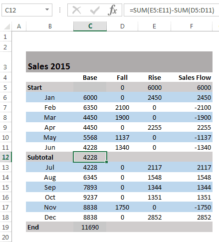
Let’s start with a simple table like annual sales numbers for the current year. You will see in the table below that the sales amounts vary for each month. Some months will have positive sales growth, while others will be negative.
- Insert three additional columns to your Excel table to represent the movement of the columns on the waterfall chart. The base column will represent the starting point for the fall and rise of the chart. You will input all the negative numbers from the sales flow in the fall column and all the positive numbers in the rise column.
*You will also want to add a Start and End row to your table to provide total values for the beginning and end of your sales year.
Step 2: Insert formulas to complete your table
The easiest way to complete your table is by adding formulas to the first cells in each of the corresponding columns and then copy them down to the adjacent cells using the fill handle.
- Select C4 in the Fall column and enter the following formula: =IF(E4<=0, -E4, 0)
*Drag the fill handle down to the end of the column to copy the formula.
- Select D4 in the Rise column and enter the following formula: =IF(E4>0, E4,0)
*Copy the formula down to the end of the table using the fill handle.
- Select B5 in the Base column and enter the following formula: =B4+D4-C5
*Use the fill handle to drag and copy the formula to the end of the column.
Step 3: Build a stacked column chart
Now you have all the necessary data to build your waterfall chart.
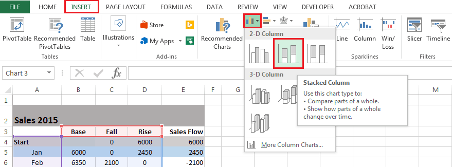
- Select the data you would like to highlight in your chart. Include the row and column headers, and exclude the sales flow column.
- Go to the Insert tab, click on the Column Charts group, and select Stacked Chart.
*Your stacked chart now appears in the worksheet, with all your data included, but it is not a waterfall chart just yet. Next, we will turn the stacked column chart into a waterfall chart.
Step 4: Convert your stacked chart to a waterfall chart
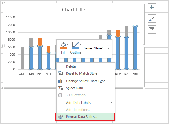
In order to make your stacked column chart look like a waterfall chart, you will need to make the Base series invisible on the chart.
- Click on the Base series to select them. Right-click and choose Format Data Series from the list.
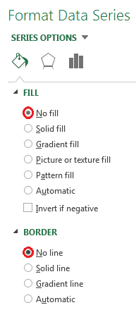
- Once the Format Data Series pane appears to the right of your worksheet, Click on the Fill & Line icon (looks like a paint bucket).
- Select No fill in the Fill section and No line in the Border section.
- Now that the Base series is invisible, you should remove the Base label listed in the legend. To do this, double click on Base in the legend, right-click on the selected label, and click Delete from the dropdown list.
Step 5: Format your waterfall chart
To make your waterfall chart more engaging, let’s apply some formatting.
- Let’s start by color-coding the columns to help identify positive versus negative values. Select the Fall series in the chart, right-click and select Format Data Series from the list.
- Once the Format Data Series pane appears to the right of your worksheet, select the Fill & Line icon.
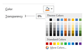
- Click on the color dropdown to select a color.
- Once you’ve picked the color for the Fall series, complete the same steps for the Rise series.
*You should also color-code the start and end columns to make them stand out, and will need to do those separately.
If you want to make your waterfall chart look a little nicer, remove most of the white space between the columns.
- Double-click on one of the columns in your chart.
- Once the Format Data Series pane opens up, change the Series Overlap to 100% and the Gap Width to 15%.
You’re almost finished. You just need to change the chart title and add data labels.
- Click the title, highlight the current content, and type in the desired title.
- To add labels, click on one of the columns, right-click, and select Add Data Labels from the list. Repeat this process for the other series.
- To format the labels, select one of the labels, right-click, and select Format Data Labels from the list.
- Once the Format Data Labels pane opens, you can adjust the label position, text color and font to make the numbers more readable.
*Once you’re done labeling the columns, you can delete unnecessary elements like zero values and the legend.
How to Add Subtotal or Total Columns
After completing your initial waterfall chart, you may decide to add a subtotal column to visualize status at a midway point. For example, in our sales flow example, it would be helpful to include a column showing mid-year sales.
- In your table, insert a row above July.
- Name the row Subtotal, and insert a formula to calculate total Rise for months Jan through Jun, minus total Fall for the same months.
- Next, you need to fill in the new subtotal column. Select the individual subtotal column in the waterfall chart. Right-click the column, select the Fill icon, and choose the color you would the column to be filled with.
Helpful Tips to Make Waterfall Charts
As you make more waterfall charts for more kinds of reports and data, there are some helpful tips that may come in handy.
- You’re allowed to enter two or more values into a column. If you have a column composed of more than one segment, you can enter an e (for “equals”) for, at maximum, one of them.
- For basic waterfall charts, every two columns are connected by only one horizontal connector. Select the connector, and it will show two handles.
- To change the column connections in the waterfall, drag the connectors’ handles.
- To start a new summation, remove the connector by deleting it. To add a connector, click Add Waterfall Connector in the context menu.
- Connectors may conflict with each other, which will result in skew connectors. You can resolve the problem by removing some of the skew connectors.
- To connect the “equals” column with the top of the last segment, drag the right handle of the highlighted connector.
- If you want to create a build-down waterfall chart, use the image toolbar icon.
- By using labels for level difference arrows, you’ll support the display of values as percentages of the 100%= value in the datasheet.
- Incorporate subtotals as a visual checkpoint in the chart.
- Customize the chart with logos, colors, etc., for maximum impact.
- Waterfall charts aren’t limited to financial analysis; they can also show user growth or any other changes in a vital base metric.
How to Create a Waterfall Chart in PowerPoint
It used to be a ponderous, difficult process to create or embed a waterfall chart in PowerPoint, but thankfully it’s now much easier in Office 365 and editions of PowerPoint 2016 and later. You’ll still need to use Excel to create the chart and values, but that functionality is built right into the newer editions of PowerPoint. Here’s how you do it.
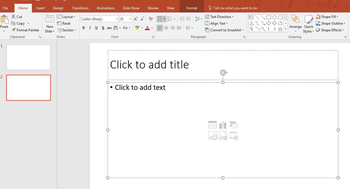
Open a new PowerPoint presentation, and add a new blank slide after the title slide. Alternatively, you can work on a deck you’ve already started, but add a new slide where the waterfall chart will go.
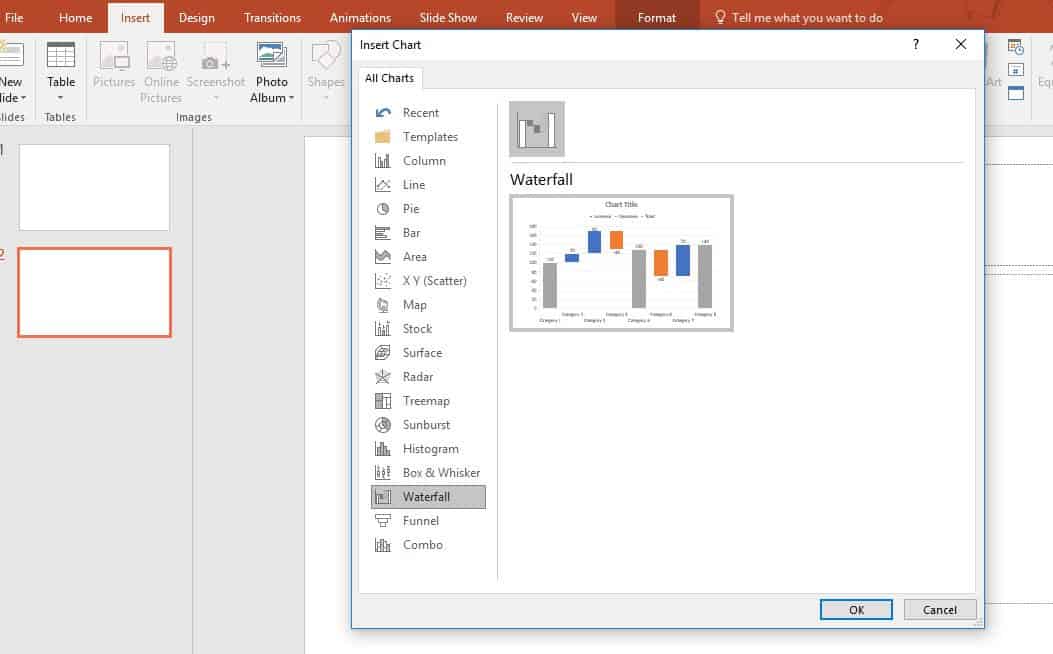
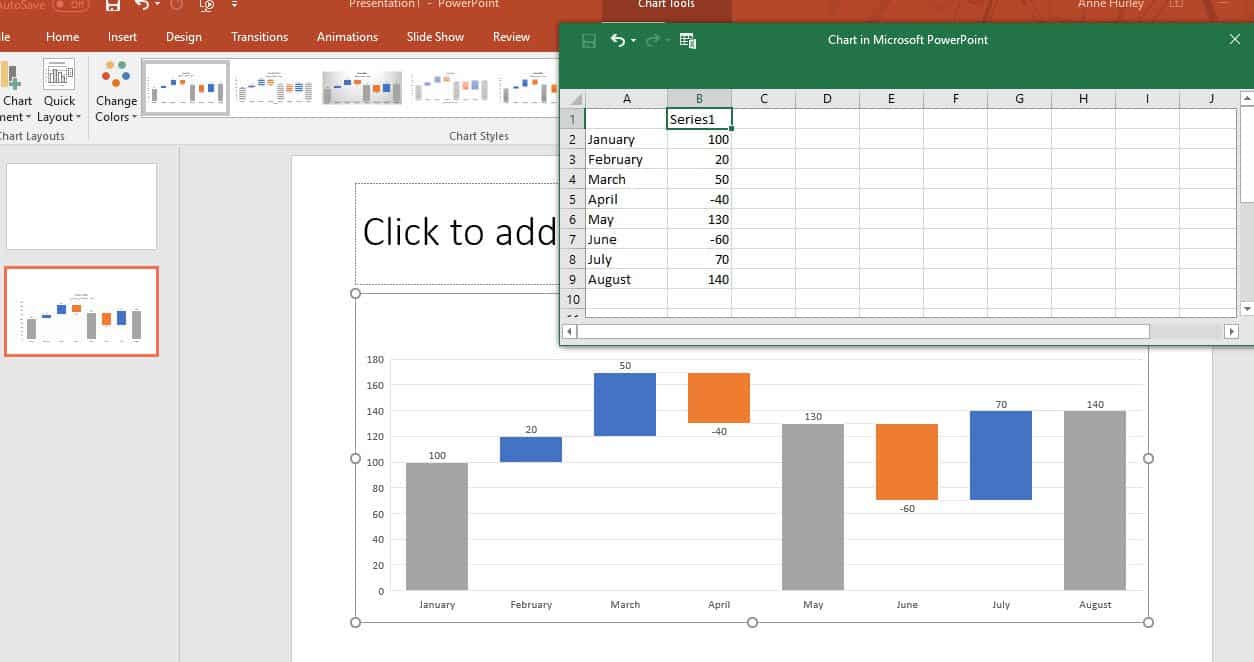
On the Insert tab, click the Chart icon in the middle of the top ribbon. On the left-hand menu, select Waterfall near the bottom.
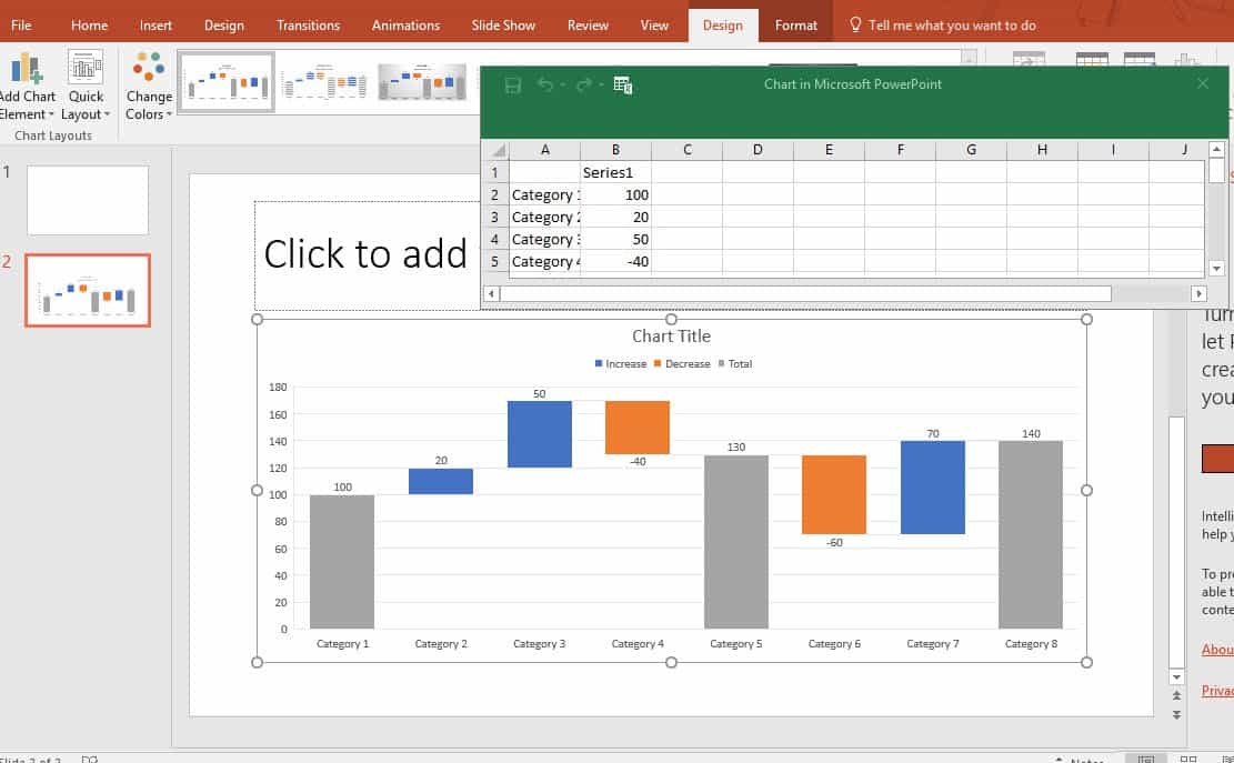
The slide will then be populated with a placeholder chart, and an Excel sheet will pop up.
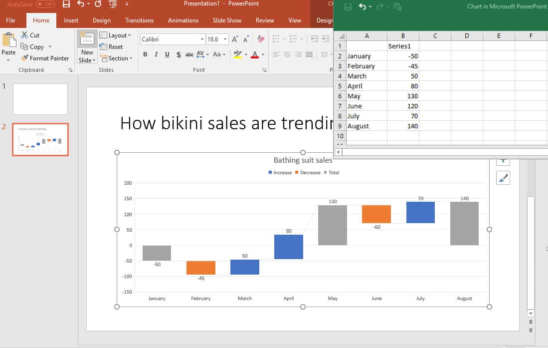
From there, add the values per the instructions for Excel above. The presentation of the blank chart is fairly intuitive to follow. The template has eight fields for measurement, but you can add more. Here, we have changed Category to the name of a month, showing eight months in a year.
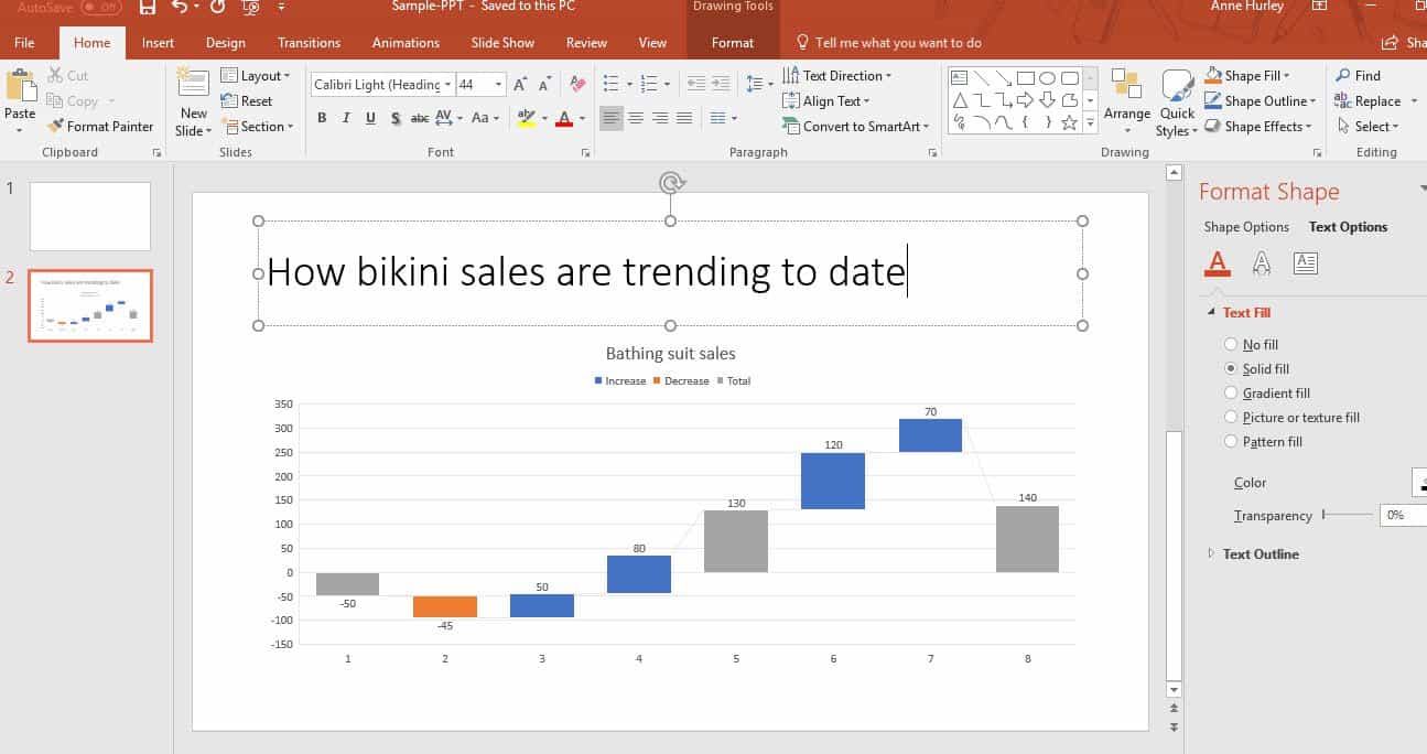
From there it’s easy to add the values for each category (in this case, month), and Excel will automatically update the working chart on the PowerPoint slide.
After you’ve adjusted and added all the values, you can close the Excel window, and the slide will graphically capture the final trends you’ve entered. You will see an area on the right where you can experiment with customization, colors, and other stylings, if desired.
A More Collaborative Waterfall Chart
Now that you’ve seen what it takes to construct a waterfall chart in Excel, I think we can agree that there is a lot to remember.
While a waterfall chart in Excel provides a way to visualize the change in value over a period of time, it doesn’t provide real-time visualization that dynamically updates as values are changed.
Luckily we have another, more collaborative way to create a waterfall chart using Smartsheet and the Microsoft Power BI integration.
How to Create a Waterfall Chart in Smartsheet
Smartsheet is a spreadsheet-inspired work management tool with robust collaboration and communication features. Smartsheet has a similar look and feel as Excel, so it's easy to start using right away yet it’s cloud-based so you can access your data and information anywhere, anytime.
Let’s create a waterfall chart in Smartsheet.
Step 1: Create a simple table in Smartsheet
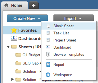
- To get started with Smartsheet, log in to your account and navigate to the Home tab.
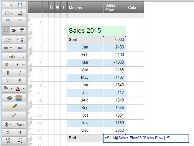
- Click Create New, choose Blank Sheet, and name your new sheet Sales Flow 2015.
- Next, create the simple sales flow table that we used for the Excel example above. Do not include the base, fall, or rise columns.
- Select cell [Sales Flow]16, enter the following formula: =SUM([Sales Flow]3:[Sales Flow]15), and hit enter.
Your simple table is complete.
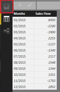
Step 2: Import Smartsheet data into Microsoft Power BI
The integration between Smartsheet and the Microsoft Power BI enables you to visualize your Smartsheet data and create beautiful and insightful charts, reports, and dashboards. To get the Microsoft Power BI, go to the Power BI website and download the free desktop connector beta. Once you’ve downloaded the connector, you can import your Smartsheet data.
- Open the Power BI Desktop, click on Get Data in the navigation ribbon at the top, and select More… from the dropdown list.
- Type Smartsheet in the search field in the upper left-hand corner. Once Smartsheet appears in the list, select it and click the yellow Connect button. You will be prompted to sign in to Smartsheet.
- Once you have connected your Smartsheet account to the Power BI, a Navigator window will appear that includes the logical hierarchy of your Smartsheet workspaces, folders and sheets.
- Scroll down to locate the Sales Flow 2015 sheet that you created. Select the Sales Flow 2015 sheet, and click the Edit button in the bottom right-hand corner of the Navigator.
- Delete any empty columns by right-clicking the column and selecting Remove. To delete empty rows, click the Remove Rows button in the top navigation and input the number of rows you would like to remove.
- Once you’re done editing the data, click the Close & Apply button in the upper left-hand corner.
Now that you have your Smartsheet data linked to the Power BI, it’s time to create your waterfall chart.
Step 3: Generate the waterfall chart
- Select the Report icon in the left-hand column of the Power BI.
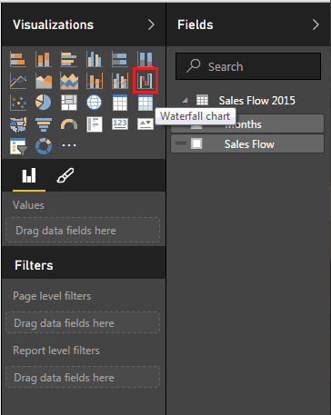
- Choose the Waterfall Chart icon within the Visualizations section in the right-hand panel.
- Next, locate your data in the Fields panel, and drag and drop the data to the appropriate fields. For the waterfall chart, you have a Category field and a Y-axis field. Drag the Months data to the Category field, and the Sales Flow data to the Y-axis field.
You’re almost done. As you notice, this chart doesn’t look like the waterfall chart we created in Excel. The default setting is to count the Y-axis data, but you actually want it to Sum the monthly data.
- To change from count to sum, click on the down arrow in the Count of Sales Flow section and select Sum from the dropdown list.
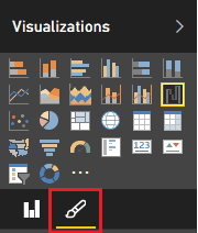
You can format your chart by simply selecting the Format icon in the Visualizations column, to add labels, change the title, and color-code your columns.
Now you’ve created a waterfall chart that will provide a dynamic, real-time visualization of your data, using Smartsheet and the Microsoft Power BI.
Build a Better Waterfall Chart with Smartsheet
Empower your people to go above and beyond with a flexible platform designed to match the needs of your team — and adapt as those needs change.
The Smartsheet platform makes it easy to plan, capture, manage, and report on work from anywhere, helping your team be more effective and get more done. Report on key metrics and get real-time visibility into work as it happens with roll-up reports, dashboards, and automated workflows built to keep your team connected and informed.
When teams have clarity into the work getting done, there’s no telling how much more they can accomplish in the same amount of time. Try Smartsheet for free, today.
